Check out my article on medium
Data visualization is the process of converting data into visual formats such as charts, graphs, maps, and infographics, to effectively communicate insights, patterns, and trends. It is a critical aspect of data analysis as it helps people to understand complex information quickly and easily.
One of the main benefits of data visualization is that it enables users to identify trends and patterns in data that may not be immediately apparent when viewed in tabular or numerical form. For example, a line graph can show changes in a data set over time, making it easy to identify trends and patterns, while a bar chart can be used to compare data between different categories.
Data visualization also enables users to communicate their findings to others more effectively. When data is presented in an attractive and easy-to-understand format, it is more likely to be remembered and acted upon. In addition, visualizations can help to clarify the meaning of data and highlight key insights, making it easier for others to understand and use the information. Per Professor Ben Shneiderman: “The purpose of visualization is insight, not pictures.”
Data Visualization in Python
Python is a popular programming language for data analysis and data visualization. There are several libraries and tools available in Python for creating visualizations, including:
- Matplotlib: This is the most widely used data visualization library in Python, and is well-suited for creating static, animated, and interactive visualizations.
- Seaborn: This library is built on top of Matplotlib and provides a high-level interface for creating attractive statistical graphics.
- Plotly: This library is well-suited for creating interactive and dynamic visualizations. It supports a wide range of visualizations, including bar charts, line graphs, scatter plots, and more.
- Bokeh: This library is focused on creating interactive visualizations for the web. It provides a high-level interface for creating visualizations that can be easily embedded in web pages.
- Altair: This library is a declarative visualization library that allows users to specify visualizations in a simple, human-readable format.
- ggplot: This library is a Python implementation of the popular R library ggplot2, and provides a high-level interface for creating complex and attractive visualizations.
- Pygal: This library is well-suited for creating static, SVG-based visualizations. It supports a wide range of visualizations, including bar charts, line graphs, and more.
In the following section, I will compare each libraries and draw the same boxplot for each of them
Matplotlib
Pros:
- Widely used and well-documented
- Highly customizable, allowing for a wide range of visualizations
- Works well for creating static, animated, and interactive visualizations
Cons:
- Has a low-level API, requiring more code to create simple visualizations
- Some visualizations can be unattractive without additional customization
Installation: pip install matplotlib
To draw a boxplot:
import matplotlib.pyplot as plt
import numpy as np
data = np.random.normal(100, 20, 200)
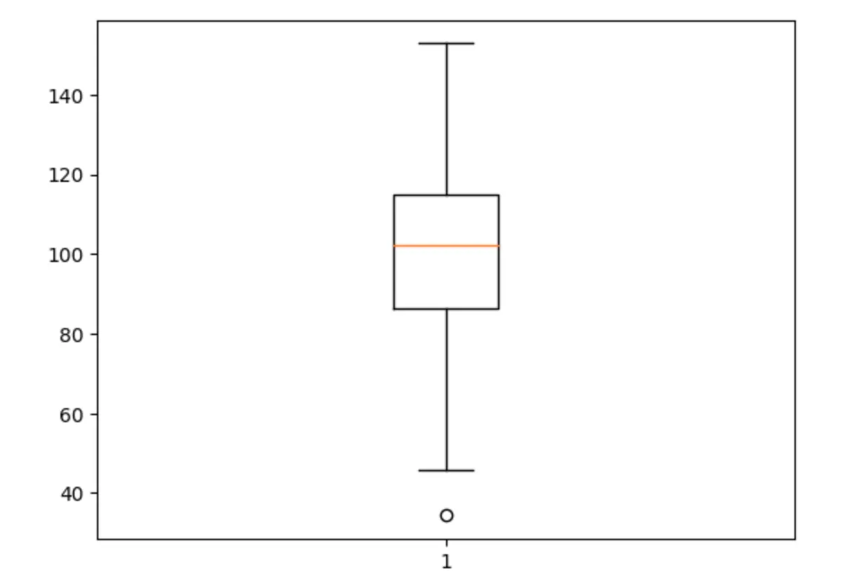
plt.boxplot(data)
plt.show()The output would look pretty vanilla plain:
Seaborn
Pros:
- Built on top of Matplotlib and provides a high-level interface for creating attractive statistical graphics
- Offers built-in support for creating visualizations for a wide range of statistical analyses
Cons:
- Can still be limited in terms of customization compared to Matplotlib
- Some visualizations can still be unattractive without additional customization
Installation: pip install seaborn
To draw a boxplot:
import seaborn as sns
import numpy as np
import matplotlib.pyplot as plt

data = np.random.normal(100, 20, 200)
sns.boxplot(data)
plt.show()Plotly
Pros:
- Well-suited for creating interactive and dynamic visualizations
- Offers a wide range of visualizations, including bar charts, line graphs, scatter plots, and more
- Easy to embed in web pages
Cons:
- Can be complex to use for some types of visualizations
- Some visualizations can be slow to render, especially for large datasets
Installation: pip install plotly
To draw a boxplot:
import plotly.express as px
import pandas as pd
import numpy as np

np.random.seed(10)
data = [np.random.normal(0, 1, 100), np.random.normal(2, 1, 100)]

df = pd.DataFrame(data).transpose()
df.columns = ['A', 'B']

fig = px.box(df, y="A", points="all")
fig.update_layout(title_text="Boxplot Example")

fig.show()There are a lot more data annotations and widgets for plotly output:
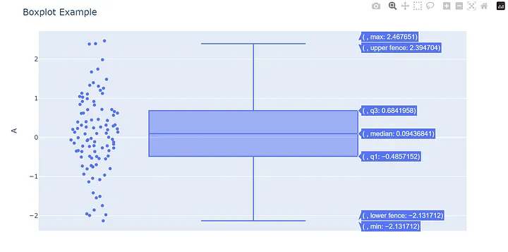
Note that in Plotly Express, you need to pass the data in a long format using the px.box function, as opposed to the wide format used in the previous examples. This allows Plotly Express to process the data correctly without encountering any errors.
Bokeh
Pros:
- Focused on creating interactive visualizations for the web
- Offers a high-level interface for creating visualizations that can be easily embedded in web pages
Cons:
- Can be limited in terms of customization compared to other libraries
- Some visualizations can be slow to render, especially for large datasets
Installation: pip install bokeh
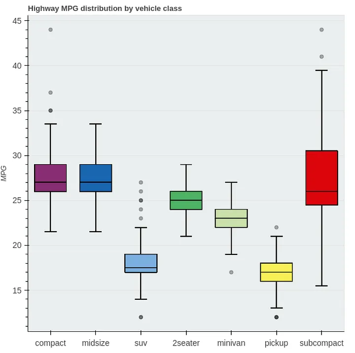
Here’s an example drawing boxplots by referring to the Bokeh documentation:
import pandas as pd

from bokeh.models import ColumnDataSource, Whisker
from bokeh.plotting import figure, show
from bokeh.sampledata.autompg2 import autompg2
from bokeh.transform import factor_cmap

df = autompg2[["class", "hwy"]].rename(columns={"class": "kind"})

kinds = df.kind.unique()

# compute quantiles
qs = df.groupby("kind").hwy.quantile([0.25, 0.5, 0.75])
qs = qs.unstack().reset_index()
qs.columns = ["kind", "q1", "q2", "q3"]
df = pd.merge(df, qs, on="kind", how="left")

# compute IQR outlier bounds
iqr = df.q3 - df.q1
df["upper"] = df.q3 + 1.5*iqr
df["lower"] = df.q1 - 1.5*iqr

source = ColumnDataSource(df)

p = figure(x_range=kinds, tools="", toolbar_location=None,
           title="Highway MPG distribution by vehicle class",
           background_fill_color="#eaefef", y_axis_label="MPG")

# outlier range
whisker = Whisker(base="kind", upper="upper", lower="lower", source=source)
whisker.upper_head.size = whisker.lower_head.size = 20
p.add_layout(whisker)

# quantile boxes
cmap = factor_cmap("kind", "TolRainbow7", kinds)
p.vbar("kind", 0.7, "q2", "q3", source=source, color=cmap, line_color="black")
p.vbar("kind", 0.7, "q1", "q2", source=source, color=cmap, line_color="black")

# outliers
outliers = df[~df.hwy.between(df.lower, df.upper)]
p.scatter("kind", "hwy", source=outliers, size=6, color="black", alpha=0.3)

p.xgrid.grid_line_color = None
p.axis.major_label_text_font_size="14px"
p.axis.axis_label_text_font_size="12px"

show(p)The output would be:
Altair
Pros:
- Declarative visualization library that allows users to specify visualizations in a simple, human-readable format
- Offers a wide range of visualizations
- Easy to use for creating simple visualizations
Cons:
- Can be limited in terms of customization compared to other libraries
- Some visualizations can be slow to render, especially for large datasets
Installation: pip install altair
To draw a boxplot:
import altair as alt
import pandas as pd
import numpy as np

data = np.random.normal(100, 20, 200)
df = pd.DataFrame(data, columns=['data'])

alt.Chart(df).mark_boxplot().encode(
    y='data:Q'
).properties(
    width=400,
    height=300
).interactive()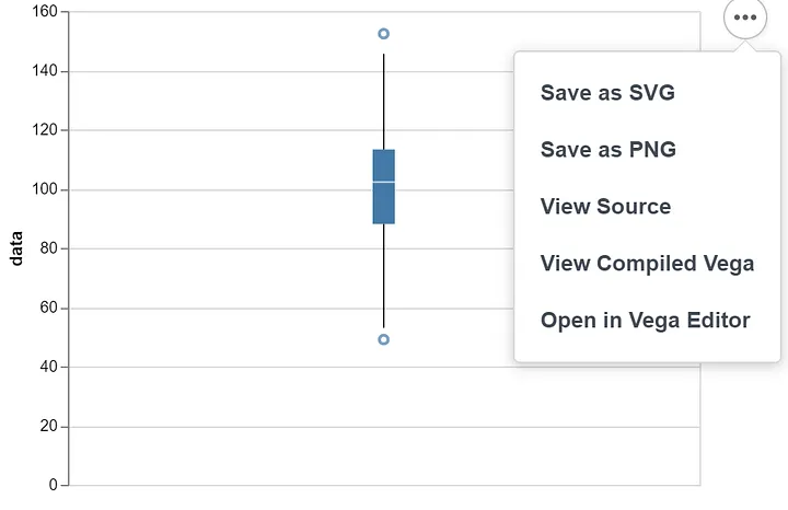
ggplot
Pros:
- A Python implementation of the popular R library ggplot2
- Provides a high-level interface for creating complex and attractive visualizations
Cons:
- Can be complex to use for some types of visualizations
- Some visualizations can be slow to render, especially for large datasets
Installation: pip install ggplot
To draw a boxplot:
import ggplot
import pandas as pd
import numpy as np

data = np.random.normal(100, 20, 200)
df = pd.DataFrame(data, columns=['data'])

p = ggplot(df, aes(x='data'))
p = p + geom_boxplot()
p.show()Note there are some compatibility issues with ggplot and pandas. If using the latest pandas, it will generate AttributeError: module ‘pandas’ has no attribute ‘tslib’.
This error occurs because the “tslib” module was removed from pandas starting from version 0.25.0.
To resolve this issue, you can either:
- Downgrade to a version of pandas prior to 0.25.0, such as 0.24.2.
- Remove any references to “tslib” in your code.
Pygal
Pros:
- Focuses on creating simple and clean visualizations
- Offers a wide range of visualizations, including bar charts, line graphs, scatter plots, and more
- Lightweight and easy to install
Cons:
- Can be limited in terms of customization compared to other libraries
- Some visualizations can be unattractive without additional customization
- May not be suitable for more complex visualizations
Installation: pip install pygal
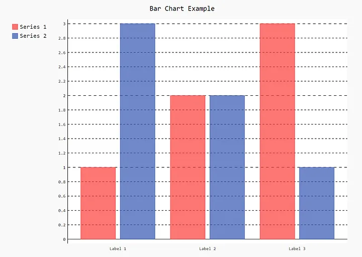
Unfortunately, Pygal does not have built-in support for boxplots. Example code for creating a bar chart in Pygal:
import pygal

bar_chart = pygal.Bar()
bar_chart.title = "Bar Chart Example"
bar_chart.x_labels = ["Label 1", "Label 2", "Label 3"]
bar_chart.add("Series 1", [1, 2, 3])
bar_chart.add("Series 2", [3, 2, 1])
bar_chart.render_to_file("bar_chart.svg")The output will be generated as a svg chart:
Conclusion
Each library has its own strengths and weaknesses. For example, Matplotlib is a low-level library and requires more code to create visualizations, but is highly customizable. Seaborn is built on top of Matplotlib and provides a high-level interface for creating attractive statistical graphics. Plotly is well-suited for creating interactive and dynamic visualizations, while Bokeh is focused on creating interactive visualizations for the web. ggplot is a Python implementation of the popular R library ggplot2, and provides a high-level interface for creating complex and attractive visualizations. Altair is a declarative visualization library that allows users to specify visualizations in a simple, human-readable format. The choice of tool will depend on the specific requirements of the project, such as the type of data being analyzed, the complexity of the visualization, and the need for interactivity.